I've been waiting for the perfect opportunity to play with this Sketch Savvy sketch and finally some great pictures fell into place. And I have finally gotten back into the doubles frame of mind. This is actually a double double page layout. Yes, I know I am clever! Lol. As most of my double layouts do, it took several evenings and part of a day to get these finished and I have to say I am happy they are finally done. I love the way these pages turned out.
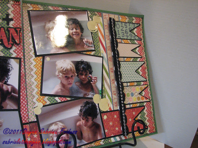
All of the paper you see on both sets is from several collections - Basic Grey's "Life of the Party", My Mind's Eye "Lyme Twist" and Echo Park's "Little Boy". I also used some solid cardstock from my stash and a few sheets of Coredinations paper. Although there is a banner shape on several of my Cricut cartridges I opted to use Make the Cut to design my banner shapes because of the ease of manipulating them. I also wanted a shadow behind each one and I didn't feel like spending the time to try to make one with my Gypsy. The title is also cut out using Make The Cut. The two fonts you see are Segoe Script (Fresh +) and Shifty Chica II (Clean). Again, its so easy to make titles with Make the Cut, I rarely do it the other way. I also added some twine to the top of the banners to do something a little different. I like the way it looks.
All of the paper you see on both sets is from several collections - Basic Grey's "Life of the Party", My Mind's Eye "Lyme Twist" and Echo Park's "Little Boy". I also used some solid cardstock from my stash and a few sheets of Coredinations paper. Although there is a banner shape on several of my Cricut cartridges I opted to use Make the Cut to design my banner shapes because of the ease of manipulating them. I also wanted a shadow behind each one and I didn't feel like spending the time to try to make one with my Gypsy. The title is also cut out using Make The Cut. The two fonts you see are Segoe Script (Fresh +) and Shifty Chica II (Clean). Again, its so easy to make titles with Make the Cut, I rarely do it the other way. I also added some twine to the top of the banners to do something a little different. I like the way it looks.
This is page Number two, and it is actually my favorite of the two. This one is going into my mother's book. The background paper is My Mind's Eye "Lyme Twist". The bathtub was cut using the New Arrival cartridge and the bubbles were cut using Graphically Speaking and Mini Monsters. I was at a loss as how to *make* bubbles so I cut out these bubble shapes, added glossy accents to them and let them sit overnight to dry. I think my interpretation is fair at best. Nothing spectacular but I'll take it. It does add to the pages. The embossing folder you see is the Cuttlebug large polka dot folder. I just rant the paper through two times using my Grand Calibur. Very simple.
Recipe:
Paper: Basic Grey - Life of the Party, My Mind's Eye - Lyme Twist, Echo Park - Little Boy, Coordinations
Cartridges: New Arrival, Graphically Speaking, Mini Monsters
Title: Make The Cut using fonts: Shifty Chica II, Segoe Script
Twine: The Twinery;
Embossing: Cuttlebug Large Polka Dots folder
Thanks for stopping by!!








I love what you did with this sketch/layout from the paper choice to the details! LOVE IT
ReplyDeleteYour boys are adorable but exact opposites of each other in looks but yet they look alike. I love seeing layouts featuring them.
Wow! These LO's are fabulous, You've inspired me to get a bit more creative with some of my pages.
ReplyDeleteThanks you guys. I have found my true love again - scrapbooking. It's terribly time consuming but I like doing it more than anything else. Of course after a week of it I'm going to be making a card next. Lol.
ReplyDeleteThese layouts are awesome! You totally nailed this:) I love all the details and the picture are just precious:) TFS! your work is amazing!!
ReplyDeleteSherrie K
http://sherriescraps.blogspot.com
I love these LOs! Awesome job on the layers and the colors.
ReplyDeleteAdorable LO's! I love all the colors and patterns. They really make the pictures pop out!
ReplyDelete